Subscribe to our mailing list


Brand Identity

Digital Lifelines Scotland seeks to improve digital inclusion and to design digital solutions that better meet people’s needs, to improve the health outcomes for people who use drugs, reducing the risk of harm and death.

Maguires were appointed to create a modern and dynamic brand to help DLS continue its valuable work in both the digital and physical worlds.

At the heart of the new brand marque are subtle references to the letters ‘d’ and ‘l’ encased within a series of interconnected curves. As Digital Lifelines Scotland is funded by Scottish Government and run as a partnership programme, these curves are designed to represent both the collaborative make-up of DLS, as well as the supportive nature of their work. The overall visual effect of these interconnecting curves provides the new brand with a distinct digital ‘fingerprint’ marque, with the line forms influenced by circuit boards. Finally, the vibrant colour palette was chosen to represent the scottish element of the organisation, with the colours based upon a Scottish thistle, sitting against a bright blue sky.

The brand also required a highly adaptive brand system to allow staff the tools to create a wide-variety of branded communications from issuing reports and papers, to presenting and attending various events and conferences.


Book Cover Design

We’ve worked with a number publishers over the years, producing original cover art for authors such as Stuart Cosgrove, Denzil Meyrick, Alan Bissett, Stuart David (once of Belle and Sebastian) and Whisky connoisseur Ian Buxton.


Recruitment Campaign

Quarriers is a leading social care charity that provides practical care and support for thousands of vulnerable children, adults and families across Scotland.

Maguires first worked with Quarriers in 2018, creating the award-winning ‘Care to Join Us’ campaign.

Since then we’ve helped to evolve the campaign, navigating through the filming challenges caused by the pandemic, to ensure this authentic, people-based campaign remains true to its original concept – the best way to promote working for Quarriers is to showcase the people themselves.

This year, the client was keen to showcase the people they care for, alongside a range of their staff, as they go about their daily duties as Support Workers.

Maguires spent several days on location at both adult and child care facilities, capturing a snapshot of day-to-day life at Quarriers.

The client was looking to expand their reach across social channels by including content for TikTok in addition to their usual Instagram and Facebook campaigns. With this in mind, Maguires supplied the marketing team at Quarriers with a number of edits of 15 second ads for both Child Services and Adult Services, so each area could be individually targeted. In addition, we provided longer cuts of each ad for TV and web, alongside a number of static ads for organic and paid-for posts and stories.


The Gateway Project

Since the start of the first lockdown in March 2020, the Maguires team has worked from home. 

What started as an enforced move has led to a successful and fulfilling new working arrangement. 

One of the unexpected results of this move is the ability for each member of the team to feel closer to their local community. Whether it’s lunches spent locally, taking the dog for a morning walk or doing the school run – we’re all better connected to where we live.

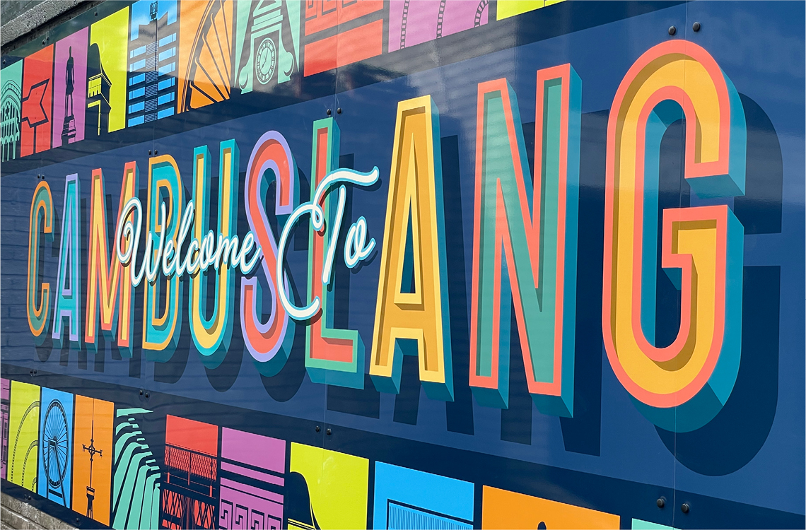
This connection led to a unique collaboration between our Creative Director Chris Hannah and his local community council in Cambuslang. 

After reading in the local press about plans to create a series of murals to brighten up neglected sites across the town, Chris was keen to offer his services free of charge, allowing the Community Council to invest their funds in ways.

Clare Williamson, vice-chair of Cambuslang Community Council and member of the Gateway Group said:

“Since we started doing community surveys in 2015, local residents have been telling us that they want a modern, vibrant, and welcoming environment for the town. Together with our streetscape project, the Gateway artwork is intended to demonstrate our civic pride, and a strong sense of belonging for local residents and businesses who live and work in the town. More importantly, we hope that the project will attract visitors and invite local people to the town centre to support local businesses to keep our town centre thriving for years to come.”

The first mural has been installed at the entrance to Cambuslang Station. Through a number of engagement sessions run by the Community Council, the most popular places and spaces in the town were identified, allowing Chris to develop a series of 12 original illustrations that would form a central part to mural design, now known as ‘The Station Wall’.

The project would also see the completion of two further murals, known as ‘The Sunflower Wall’ and ‘The Welcome Wall’. As these two murals required painting – rather than the printed vinyls boards at the Station Wall – Chris engaged the services of signwriters Artisan Artworks.

The idea for ‘The Sunflower Wall’ mural came from a simple act of kindness. During lockdown, five year old Hamish Shea grew a sunflower from seed and left it in a pot on the town’s main thoroughfare for everyone to enjoy. 

Local residents were so touched by the gesture that Cambuslang Community Council was inspired to create a mural and a permanent seating area with planters in the same spot.

The final mural – ‘The Welcome Wall’ – acts as a vibrant signpost for those entering the town, distinct in its own right, but utilising the same colour palette used across all three murals.

As well as receiving record levels of engagement for the Community Council on social media, the story of Hamish and the Cambuslang murals attracted local and national press coverage.

The Gateway Project is a partnership between Cambuslang Community Council, Cambuslang Rotary Club, Grow 73, Network Rail, Scotrail, National Lottery, Community Rail Partnership, local residents, Maguires Agency, SLC Rutherglen and Cambuslang Area Committee, SLC Ground Services, SLC Unpaid Work Team, SLC Youth Family Community Learning Service.


Open Evening Campaign

St Aloysius’ College is a leading independent school based in Glasgow. 

In 2019, Maguires created the highly successful campaign, ‘The Start of Something Great’, to promote the school’s annual open day.

Over the next few years, the campaign was successfully retained, with the central ‘hero’ images being updated each year, with additional video and web content added into the marketing mix, to further strengthen the offering. 

For 2022’s campaign, the client was keen to evolve the campaign style, while still remaining true to what made the original campaign successful.

Maguires was also commissioned to capture a fresh bank of photography of school life for the in-house social media team. 

This saw us spend two days at the school, across several locations, capturing a wide variety of school activities. From this we were able to assemble a fresh collage style and an expanded range of ‘hero’ pupil shots, providing variety and diversity for the digital and outdoor campaigns.

Finally, this year we decided to create a small thank-you for our ‘heroes’. Each pupil’s family was sent individualised posters with their name adapted to be part of ‘The Start of Something Great’ strap-line.


Ciao at Rico’s

The Rocca Group was looking to expand its evening offering with the opening of Ciao, a specialist cocktail bar set within Rico’s, the renowned eatery on North Castle St in the heart of Edinburgh’s New Town.

Maguires were commissioned to create the brand for the new bar, having worked with The Rocca Group creating social content for Rico’s as well as their two sister venues: The Michelin-guided Seafood Ristorante in St Andrew’s and The Broughton in Edinburgh.

Opening November 2022, Ciao offers delicious drinks alongside cicchetti – small Italian snacks – as well as a lunch menu freshly prepared by the famed Rico’s kitchen. Their resident mixologists pride themselves on the The Negroni, a classic Italian cocktail containing gin, campari and sweet vermouth. As well as the classic version, many variations on the classic cocktail also appear on their extensive drinks menu. 


Aberdeen Market

Currently under development on the site of the former British Home Stores on Union Street, Aberdeen Market is set to be a unique destination featuring international food and drink outlets, local traders, businesses and artisan workshops.

Having worked with Savills on marketing a number of high profile commercial properties on Glasgow’s renowned ‘Style Mile’, Maguires was approached to create a bold and modern identity for the development.

Taking inspiration from the triangular structures set within the unique roof canopy, coupled with the mix of modern materials present in the interior, we created a distinct logo marque and accompanying marketing brochure, as well as a number of striking window vinyls and adverting hoardings on Union Street.


Branding & Launch Campaign

Former Sassoon Colour Director Emma Loen is a rising star within the hairdressing profession. In 2022 she initiated a new venture and opened her first independent salon in Finnieston, Glasgow, offering an exceptional, bespoke hair care experience within a collaborative and creative space.

To realise the full potential of her new salon, Emma required stylish and contemporary branding which would roll out across an extensive range of offline and online assets. 

Working closely with Emma, we designed a full logo suite including logotype and graphic marque variations, external signage, business cards, website with book online functionality, service menus, gift cards, wrapping tissue paper, tote and paper bags, and even slipmats for in-house DJ turntables.

Emma also commissioned Maguires to produce a brand film, stills and social content. To date, the brand film has reached 94,128 people based within Scotland, with 6,844 link clicks to the Emma Loen website. 

Since launching in April, Emma’s business has gone from strength to strength, with an ever-growing client list and an upcoming ‘salon collection’ launch scheduled for March 2023.


Stadium Banners

Having been in place since 2015, the banners wrapped around the exterior of Celtic Park became a firm favourite with supporters and visitors to Celtic Park – known to Celtic fans the world over as ‘Paradise’. 

In 2022, with the league title secured, and a new manager playing an exciting brand of football, the club approached Maguires to create a fresh progressive design for the stadium.

After undertaking a period of creative development with the client, we proposed a modular graphic approach that still celebrated the Celtic story, but also reflected the club’s current position and culture.

Visually, this graphic approach would allow us to unify the look of the stadium by increasing the presence of green across all four stands – creating a ‘beacon of green’ that would further highlight the presence of the stadium across the city.

Visible from several miles away, the two larger goal-end stands would act as gateways to the stadium, with clear messaging welcoming fans to Celtic Park. Given pride of place in the centre of the design are two of the club’s most celebrated captains, representing the club’s European triumph in 1967 as well as their recent successes.

The two small corner stands provided an opportunity to include a greater depth of detail. Here we created an array of graphic elements and iconography from Celtic’s past, highlighting the club’s culture, ethos, icons and achievements. From the famous quote from legendary Celtic manager Jock Stein, “Football without the fans is nothing” to the crisp vertical pinstripes first worn in the early 80s by legends including Danny McGrain and Paul McStay, each square within the design tells a story.

The banner designs also saw the introduction of an expanded colour palette. In addition to the classic green and white, we introduced a range of complementary greens, influenced by a number of iconic away strips. 

Finally, the evolution of the Celtic brand throughout its 134 year history is also reflected in the varied choice of font styles used – from the retro letter forms of ‘1888’ to the modern condensed fonts of the 21st century. 

Drone footage courtesy of HawkAye


The Celtic Way Banners

Following the post-pandemic return of supporters to football stadiums in Scotland, Celtic Football Club approached Maguires to design the banners that line the paved approach to the front of the stadium – known as ‘The Celtic Way’.

Having worked with the club in 2020 to redesign the tunnel and player areas within the stadium, we had begun developing a strong typographical style based upon key figures and phrases from the club’s history, coupled with a tweaked colour palette. The club were keen to see this new style adapted to The Celtic Way, with the message ‘One Club Since 1888’ brought to life.

We decided to approach the design of all 20 banners separately, giving each word and date their own unique typographic treatment, encased within green and white blocks to mimic the famous Celtic hoops when viewed together.

The variety of designs provided for the banners were so wide-ranging that the club decided to incorporate a variety of the graphic elements into the match day comms created by their in-house team for the upcoming season.


Celtic Christmas Campaign

Following a successful pitch, Maguires were employed to provide the creative concept and graphic style for Celtic Football Club’s Christmas campaign.

The brief was to highlight the array of international talent now assembled at Celtic Park, following the appointment of Australian manager Ange Postecoglou earlier in the year.

We created the campaign strapline ‘Sending Cheer Far & Near’ with an accompanying logo and graphic style, which takes its visual cues from international travel and Santa’s mail room.

As well as designing the annual gift catalogue, we provided a comprehensive campaign toolkit and guide for the Celtic in-house team to use across over 500 sales assets. In addition to this, many of the graphic assets were featured prominently in the highly successful campaign film, produced by Arteus.


Buchanan Street Branding & Brochure

Glasgow’s extensive retail offering includes three main shopping streets in the city centre – known as ‘The Style Mile’ – with Buchanan Street at its heart.

Ranked second in the UK retail hierarchy, behind only London’s Oxford Street in terms of CACI rating, Buchanan Street is home to an array of mainstream retailers and aspirational brands.

However, as high streets across the UK adapted to a post-pandemic world, operators Hines showcased a unique opportunity for premium retailers to take over rarely available commercial space in an iconic location at the top of the street.

Maguires were tasked with creating the sales credentials brochure for the opportunity and accompanying window vinyls across all units. We also commissioned original photography and a video walk-through to supplement the marketing offering.


Branding and Ident

Can Do is a collaborative enterprise that was launched in 2013, set up to support entrepreneurship and business innovation within Scotland.

Throughout the year they host a programme of large-scale events that bring SMEs and start-ups together to promote creativity and opportunity within their fields.

In 2021, Maguires were tasked with refreshing the existing brand identity, which would be used widely throughout their social media, website, and other digital platforms.

We approached the project by creating a folded typographic style, that together with a new colour palette and accompanying graphical elements, helped better position the brand in a forward-facing sector. Finally, we brought the brand to life with an intricate animated ident that uses kinitec motion that locks into place as the logo builds.


Restaurant Branding & Advertising

In July 2020, Joe Lazzerini and partner Amalia Colaluca took over the reins of The Hebridean – a gastro pub in Glasgow’s vibrant West End – formerly owned by Nico Simeone.

Maguires was tasked with developing the new brand identity, photography suite, brand films and provision of an ongoing digital marketing strategy and implementation for the new venture.

After a highly successful launch in September 2020, bookings and word-of-mouth recommendations were flooding in.

Instagram followers increased by 2,702 with Facebook likes up by 764, within just 3 months. The new website also outperformed expectations, with 62,467 page views from September 2020 to December 2020 – exceptional numbers for an independent restaurant operating in a highly competitive market. The Loveable Rogue’s social audience were also highly engaged, with 105k video views and 10,714 link clicks to the website or online kiosk.

However, opening a restaurant in 2020 was not to be without its challenges. The closure of restaurants at 6pm and the ban on alcohol sales in October was followed by a second three-week lockdown in November and December.

Having anticipated the arrival of this second wave of restrictions, ‘The Rogue at Home’ was developed – providing a beautifully boxed ‘at home’ offering of The Rogue’s popular Sunday Roast. This was quickly followed up in December with The Loveable Rogue’s Christmas Day Dinner Box, a four-course festive feast delivered to your door.

Maguires provided the branding, accompanying films and stills to promote both new offerings.

At time of writing, ‘The Rogue at Home’ continues to provide diners a unique at home dining experience as anticipation builds for the reopening of the restaurant in the later part of December (2020).


Brand Identity, Photography & Advertising

Urban Grocer are a family-run business with a rich heritage in the fresh fruit and vegetables wholesaling industry, dating back over 70 years.

The Urban Grocer brand was launched in 2013 to supply fresh produce straight to restaurant kitchens. In 2020, against the backdrop of the first National lockdown, they decided to take that experience and expertise and offer a direct-to-consumer delivery service.

Customers can choose from a range of expertly curated fresh fruit and vegetable boxes as well as offering a range of premium pantry items and high-quality meat and poultry.

Maguires created a fresh brand identity and a bespoke suite of food photography in order to help the Urban Grocer brand ma­ke the transition to a UK-wide delivery service.

The new brand identity was launched in early December 2020, as part of a targeted social campaign. Maguires produced an animated explainer video to help showcase the service to new customers as well as a series of product-specific remarketing campaigns and seasonal box promotions and mailers.

As part of an ongoing creative retainer, we will be developing new marketing strategies to help expand their customer base, creating new content to improve social engagement and build brand recognition throughout the UK.


Keeping Safe Keeping Social – Covid Campaign

Princes Square is one of Glasgow’s best-loved shopping destinations.

Due to the global Covid-19 pandemic all non-essential retailers who resided in Princes Square were required to close their doors for several months, from late Spring to early Summer 2020.

When it was announced that shopping centres were finally allowed to reopen, there were a wide range of essential health and safety measures that were required to be implemented before reopening.

Maguires was instructed to develop a campaign which would both showcase this exciting reopening and also act as a set of clear guidelines for customers.

In order to ensure all its customers, and staff, were able to safely enjoy this new shopping experience, we developed ‘Keeping Safe, Keeping Social’.

The simplicity of the strapline helped to communicate the dual requirements of following the safety advice while still recognising the need to socialise with friends – something everyone had been deprived of during the long hard months of lockdown restrictions.

The colourful graphic style was based on the familiar ‘no access’ tape regularly seen throughout post-lockdown public spaces, most commonly seen as diagonal black and yellow stripes.

By utilising the brand colours developed for Princes Square in our 2019 After Hours campaign, we were able to bridge the gap between the ‘safe’ and ‘social’ elements.

This graphic style helped form the basis for a series of in-centre posters, banners and stickers. An instructional video was also designed and animated using this new style, providing a joined-up look-and-feel for all of the centre’s post-Covid communications.

The campaign continued throughout the Summer of 2020 and allowed Princes Square the flexibility to re-use campaign assets as and when required.


DHI Rebrand

The Digital Health & Care Innovation Centre (DHI) is part of the Scottish Funding Council’s Innovation Centre Programme, which is designed to support transformational collaboration between universities and businesses.

Following a successful tender submission, Maguires were appointed to reposition the brand identity for DHI – a partnership between the University of Strathclyde and Glasgow School of Art.

Our brief was to move the existing brand marque forward before developing a fresh graphic style and accompanying corporate toolkit that better represented the future-facing nature of the organisation.

Alongside a robust brand guidelines document, we produced a series of templates for the in-house design team for a varied degree of internal and external applications. These ranged from White Paper reports to infographics, merchandising and exhibition materials.


Virtual Tour Website & Films

St Aloysius’ College is a leading independent school based in Glasgow.

In 2019, Maguires created the highly successful ‘The Start of Something Great’ campaign to promote their annual open day (view the full case study here).

One year later, and with the world in the throes of a global pandemic, the likelihood of a traditional face-to-face open day was slim. Anticipating this, the school briefed us to explore an alternative solution which helped prospective parents and pupils learn about the school in advance of applying.

We knew that a virtual open day would clearly be a necessity. This would allow for direct communication between parents, staff members, and pupils – both current and prospective. To this end, we engaged our events partner (and client) Cameron to discuss the requirements for a live virtual event.

Our ambition was to bridge the gap between the experience of a physical event and that of a virtual one. This would allow prospective parents to tour through the campus at their leisure, getting a sense of the school environment and the beauty of the city centre location.

Our solution was a bespoke, informative and feature-rich microsite that would provide a range of multimedia content which could be explored in advance of the live virtual event. The main body of the microsite was a series of six films that would help to tell the story of St Aloysius in greater detail. Using a range of interviews with staff, pupils and parents, coupled with reportage footage of the campus, facilities and daily school life, the final films each focused on a different element and resulted in over 20 minutes of high-quality content for viewing.

Alongside this, we commissioned a bespoke 3D map of the campus, drone footage of the building exteriors and a 360-degree interactive tour which showcased the inside of the main school buildings.

Finally, the virtual tour website provided a prospectus download (also designed by Maguires) and an online application form for the open day.

The site acted as a vital companion to our digital advertising campaign, which pushed traffic to an online applications page. The virtual tour site was then served to interested applicants as well as being pushed out as part of a separate, targeted social media campaign.

The results for the 2 virtual open days (Senior School, and the Junior School) were hugely encouraging. Since the campaign commenced in November, there have been 26,851 link clicks to the microsite from social channels. Campaign content served on social channels has had a total reach of 65,551 with 28,995 video views by early December 2020.


Recruitment Campaign

Having developed the highly successful, and award-winning, ‘Care to Join Us’ campaign for Quarriers, we were faced with a challenge on how to develop the visual content of the campaign during the first National lockdown. As both parties were required to stay at home, aside from an hour’s exercise a day, we had no means of shooting new footage of Quarriers staff in order to create fresh content for this year’s campaign.

We proposed using existing audio tracks of various Quarriers care workers, recorded as part of an earlier radio campaign, as the basis for a reimagined set of animated ads for this years’ social campaign.

By selecting three of the stores, as told by the Quarriers care workers, we create a series of playful animations, using a little ‘creative’ licence in the depiction of the scenes being described.

These three animations were brought to life by the wonderful Donna McAvoy and contained within the existing ‘Care to Join Us’ campaign banner.

We were then able to provide the Quarriers recruitment team with the required creative assets with which to run their unique lockdown recruitment drive via their own social channels.


Princes Square After Hours Campaign

Princes Square is an institution in Glasgow. A former merchant square, constructed from blonde sandstone in 1841, it was named ‘Scotland’s Favourite Building’ in 2016. It’s a shopping destination unlike any other in Scotland.

Nestled within Glasgow’s ‘Style Mile’ on Buchanan Street, it’s long been known for its luxury stores, lively restaurants and bars. Now, with the arrival of Everyman boutique cinema, it offers the perfect night out, all under one elegant roof.

Maguires were tasked with creating awareness of Princes Square as a great destination for a night out – and not solely a premier shopping destination.

We created the ‘After Hours by Princes Square’ campaign, showcasing the energy and vibrancy of a night out in Princes Square.

To keep the campaign look-and-feel representative of the Glasgow scene, we worked closely with Sassoons Hair Salon in Princes Square, who helped us source and style our real-life models – with many selected from the luxury boutiques within Princes Square itself.

The focus of the outdoor advertising campaign is primarily on individual models, giving four ‘hero’ posters – each shot in a different environment to highlight the full offering of a night out at Princes Square.

Inspired by the bright pastel hues of the colour-changing neon lights found throughout the entrance-ways of Princes Square, the art direction of the campaign featured a similar range of bold colours and neon backdrops to create a sophisticated nightlife look.

We also shot an accompanying promotional film to help bring the campaign to life on Princes Square’s social channels.


Season Ticket Campaign

Following a successful pitch, Maguires were appointed to provide a creative multi-channel campaign to promote the sale of 2019/20 season tickets for Celtic Football Club.

Celtic Park, known to fans simply as ‘Paradise’, has long been considered one of football’s greatest venues. Over the years, many of the sport’s biggest names have lined up to praise the unique atmosphere generated on match days at ‘Paradise’.

“I’ve been fortunate to play in some great stadiums in Europe with Barcelona but none compare to Celtic. The atmosphere their fans create make it a very special European night of football.”
Lionel Messi

“Anyone going to Celtic Park now is saying, ‘You’ve got to beat that atmosphere, the energy they spend in their games’.”
Sir Alex Ferguson

We wanted to highlight this unique atmosphere in our approach, with a compelling call to action and strong visual style that would highlight this unrivalled energy created by the fans.

The notion of the crowd being the ‘12th man’ is not a new one. However, what if the power generated by the fans was so strong it bestowed super-human powers upon the players?

We called this the ‘Power of Paradise’.

By asking fans to renew their season ticket, we appealed to them to ‘Unleash the Power of Paradise’ – a rallying call that would result in the players being even faster, stronger, and more powerful next season as a result.

We created six ‘hero’ images highlighting certain ‘powers’ attributed to key players, allowing us to create a distinct and varied campaign for deployment across press and outdoor, as well as the club’s own social channels.

As part of our initial pitch, we suggested creating an accompanying video to the main campaign. With the concept behind the video being how the stars of the campaign would act with such powers in the day-to-day routine of training.

Working with production company Arteus and Celtic’s in-house production team, we created the ‘Power of Paradise’ video – a more light-hearted look at our heroes and how their powers come into play at training. The video amassed over 168,000 views on Facebook alone, with the outtakes a further 71,000 views.

All 10,000 spaces on the waiting list for season tickets were filled with over a month to go before the May 10th deadline.


Branding, Web Design & Social

Formerly Cameron Presentations, this forward-thinking, 70-year-old, family-run events company were looking to revitalise their entire communications landscape with a new look and feel across all media channels. Our mission was to design and produce a brand, website and digital comms strategy which projected Cameron’s evolution and confidence within an ever-changing and highly competitive industry.

Using ‘connecting ideas’ as a working strapline, we devised bespoke dot matrix patterns or ‘circle clouds’ which represented the notion of connectivity and alluded to light / sound wave patterns. This formed the cornerstone of the brand identity and allowed for extensive flexibility in creative execution. A vibrant and confident set of colour gradients were developed, working harmoniously with the circle clouds and providing the brand with a robust, flexible graphical backdrop. The clean, confident brand identity was then deployed in a number of new marketing materials, including letterheads, business cards, brochures, bespoke envelopes, van livery and signage. Added value came from the development of a bespoke desktop app which animates the circle cloud pattern, allowing for variations in both ring speed and wave width.

A clean, modular web build was designed and developed which projected Cameron as leaders and innovators in their sector and projected the company as an ‘Events Agency’.

Copy style was an integral aspect of the new Cameron identity – they were looking for a fresh and bold tone which differentiates them from their competitors and aligns with their ‘fun, friendly, creative’ ethos.  All copy for both offline and online comms was written from the ground up by Maguires’ in-house copywriting team, ensuring both brand identity and copy style align seamlessly.

Our social and digital strategy needed to be vibrant, on-brand and engaging, ensuring cut-through to captivate the Cameron crowd and increase social interactions. Using a mix of paid-for and organic content on Facebook, LinkedIn, Twitter and Instagram, as well as a robust Google AdWords campaign, our strategy and content creation ensured huge spikes in engagement and massive increases in website click-throughs and online enquiries.

Check out the new website and some of the stats below.

www.wearecameron.com

Website sessions up by 70%
Page views up by 75%
User session duration up by 31%
Pages per session up by 18%

The stats above reflect the % change in key stats on the old Cameron website vs. the new Cameron website for a period of 30 days after launch.


Summer Campaign

20 20 Opticians are part of the Duncan & Todd Group, one of the UK’s largest optical retailers. They have seven locations throughout Scotland, offering high-quality eye care, as well as award-winning lenses and frames.

The client was looking for a summer campaign that would promote their own-brand frames.

Maguires proposed a style of photography which would contrast the more lifestyle-based model campaigns often associated with high street opticians.

We also wanted the photography style to stand out as being from the 20 20 brand, as it was likely to be seen alongside promotional posters for various designer brands also available in store.

By using 20 20’s distinctive red and green colour palette across all of the posters, we created a striking series of hero posters.

To ensure a more authentic look, we didn’t use model agencies – instead sourcing models from the streets of Glasgow to complete six ‘hero’ posters.

The campaign was deployed throughout all seven stores nationwide, as well as online, in press and as a series of animated 6 sheets.


Branding & Food Photography

Stravaigin is one of the best-known restaurants and bars in Glasgow. For over 20 years, they’ve taken pride in using local produce to create internationally-inspired Scottish dishes.

Having been approached to promote Stravaigin’s monthly 5 course fine dining events, we were first tasked with refining the Stravaigin brand.

The logo had gone through a number of iterations over the last 20 years, with several versions still in use throughout the restaurant. We simplified the original logo using typography sympathetic with the Art Nouveau style of the original brand.

Previously hidden within the logo, the ‘Think Global, Eat Local’ ethos was elevated to its own brand marque, acting as a companion to the main logo. This ethos was the essence of their brand, so by creating a separate marque and producing it as a simple ink stamp, we allowed this ethos to be branded on everything that they do.

In addition to the logo, we introduced a new brand colour – influenced by the dark natural wood interior and game-filled menu. This helped provide a fresh look for the staff, with uniforms and hand-stamped business cards.

Finally, we designed a series of menus, from À La Carte to Brunch, Cocktails to Daily Specials, and everything in-between.

The new brand allowed us to create a unique look-and-feel across all communications, including a series of targeted social media campaigns. The first of which was a campaign to promote the new À La Carte menu from Chef James MacRae.

In addition to the branding and marketing responsibilities, the Maguires in-house team provided all photography used across the paid-for social campaigns.


One Night Wanders Series

Stravaigin is one of the best-known restaurants and bars in Glasgow. For over 20 years, they’ve taken pride in using local produce to create internationally-inspired Scottish dishes.

Maguires were approached to provide a distinctive advertising style and marketing strategy to promote Stravaigin’s monthly 5 course fine dining events. Each event had a unique culinary focus, with the menus taking inspiration from a particular country or world region.

The creative had to be distinctively ‘Stravaigin’ in style, whilst also illustrating the geographical focus of that particular month.

Taking influence from the reclaimed fixtures and salvaged antiques found inside Stravaigin, we identified geographical and culinary features from each of the countries to create unique artworks for each event. This led to multiple creative executions for our targeted social media advertising campaign, as well as posters, flyers, emails and menus for the event staff.

Having already redesigned the Stravaigin brand, we were keen to provide a strong creative rationale to tie all of these events together along with the new brand. As ‘stravaig’ is an old Scots word meaning ‘to wander’, we proposed presenting each of the events as part of a series, which we called ‘One Night Wanders’.


2018 Season Campaign

Now recognised as Scotland’s Theme Park, M&D’s is unique in Scotland. There are over 70 rides and attractions throughout the park, including thrill rides, kids’ rides, 18 hole miniature golf, glow in the dark indoor bowling, a massive indoor complex, a gigantic soft play area, bars, restaurants and an indoor tropical rainforest.

Maguires were tasked with updating the marketing strategy and creative look and feel for the 2018 season, to appeal to a teenage audience.

We developed a series of playful images showcasing the variety and the excitement on offer at M&D’s, with the ‘hero’ of each image being ‘text speak’ associated with a fun visit to M&D’s.
The campaign ran across all print and digital communications, as well as a substantial outdoor campaign.


Brand creation & launch

Following a successful pitch, Maguires were appointed by Stirling Council to create and launch a new brand and marketing campaign for the Stirling area.

The initial stages of the brand development saw us undertake an extensive three-month consultation process, where feedback was gathered from key stakeholders and residents. This process covered both city centre and rural areas, stretching from Crianlarich and Aberfoyle, to Dunblane, Bannockburn and Callander.

The result of this process saw the creation of the brand ‘Stirling: Alive with Scotland’ – illustrating that Stirling is a place where you can find all that is good about Scotland; its history, beauty, ingenuity as well as the wide-ranging opportunities it offers.

(more…)


Re-brand, social & content strategy and website

Refined branding for established, reputable kitchen experts.

Maguires started working with Palazzo Kitchens & Bathrooms in 2016, developing a new brand and website.

Since then, we’ve been running Palazzo’s social channels, generating new leads each month through a series of paid-for campaigns, case studies and lifestyle blogs.

All of the content for the case studies and blogs are created in-house at Maguires, with original photography and copywriting included in our monthly fee. This enables Palazzo to regularly showcase their craft, while helping provide continued engagement with potential customers.

Word-of-mouth recommendations from satisfied customers are important to Palazzo. This is why reaching out to potential customers through Facebook is vital to their growth. Maguires have developed a clear and concise social media marketing strategy which emphasises the quality of the Palazzo service.

By utilising a combination of sophisticated targeting and high-end photography & video content, Maguires have been able to consistently build the Palazzo social audience and continuously increase the number of high-quality leads.

Our detailed SEO strategy has seen Palazzo Kitchens climb to the top of the rankings for a selection of vital key terms, including the #2 position for “kitchens Glasgow”. The Palazzo website bounce rate out-performs the average for organic visits, increasing organic lead generation consistently month on month, with Cost Per Click (CPC) on Facebook also falling well below the average.

In addition, Social SEO optimisation has taken place, with Maguires helping Palazzo to increase the number of 5-star reviews the company receives on specialist interior design social network Houzz, as well as on Google and Facebook.

palazzo.co.uk


Branding & Signage

Having worked with Nico on the branding of his ‘111 by Nico’ restaurant, Maguires were again tasked with creating branding and signage for the new restaurant.

‘Six by Nico’ is the brain-child of renowned Glasgow chef Nico Simeone. Located on the fashionable Finnieston Strip –  ‘Six by Nico’ sees Nico and his team create a themed menu every six weeks.

Since opening in April 2017, the restaurant has gone from strength to strength, with waiting lists of up to two months.


Vacancies

Get in touch

Thanks for getting in touch!
We'll endeavour to get back to you within 24 hours.