Overview
One of our existing social clients, a Glasgow-based utilities consultancy, was looking to reinvent itself with a new brand name that better reflected its blue chip client list.
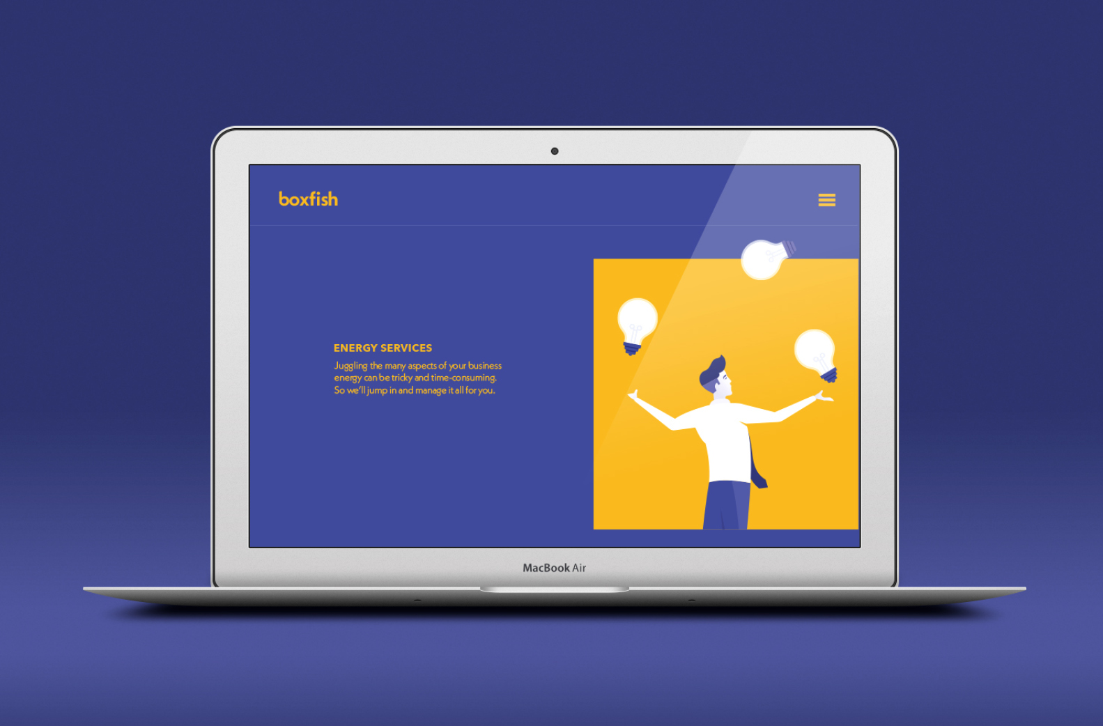
As well as the new brand name and identity, we were also tasked with the design and build of the accompanying website and digital marketing strategy.
One of the key objectives of the brief was to ensure the new brand would stand out in a very competitive and ever-changing industry.
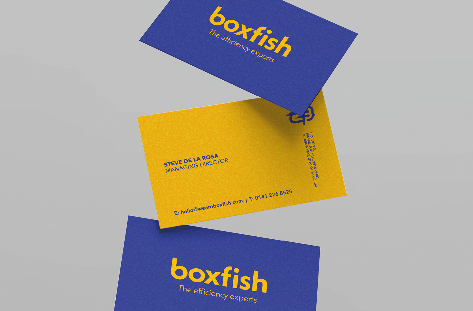
It started with the name. After countless brainstorming sessions – in which we analysed the core offering of the business, its values, and its competitors – boxfish was born.
A rare and surprisingly agile creature, the boxfish is known for its impressive efficiency and streamlined movement; the way it cuts through the current with ease. For a company that prides itself on maximising cost efficiencies, saving its clients time and money – it was the perfect fit.
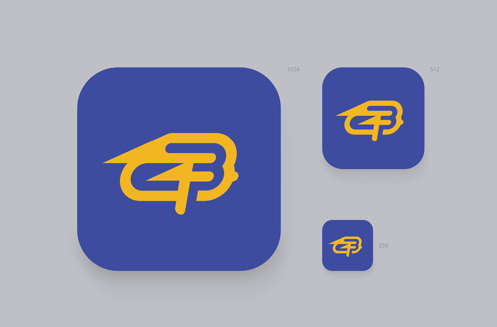
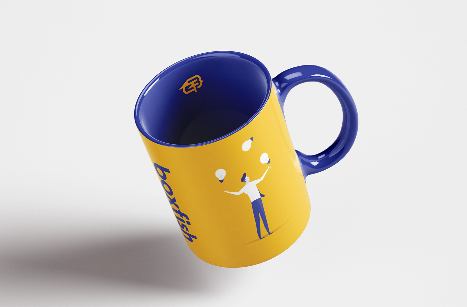
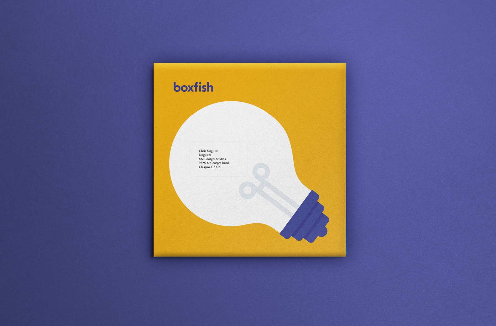
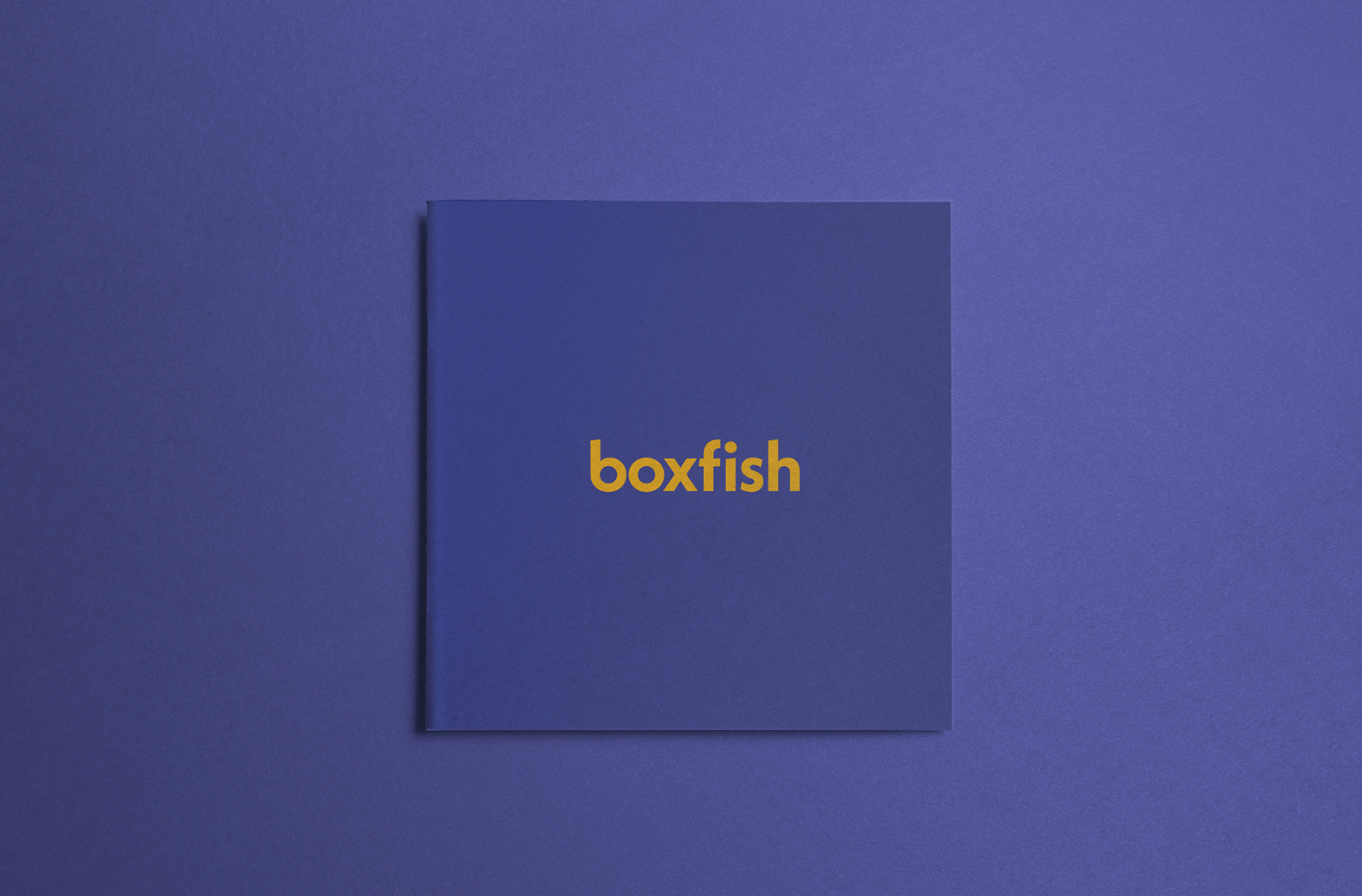
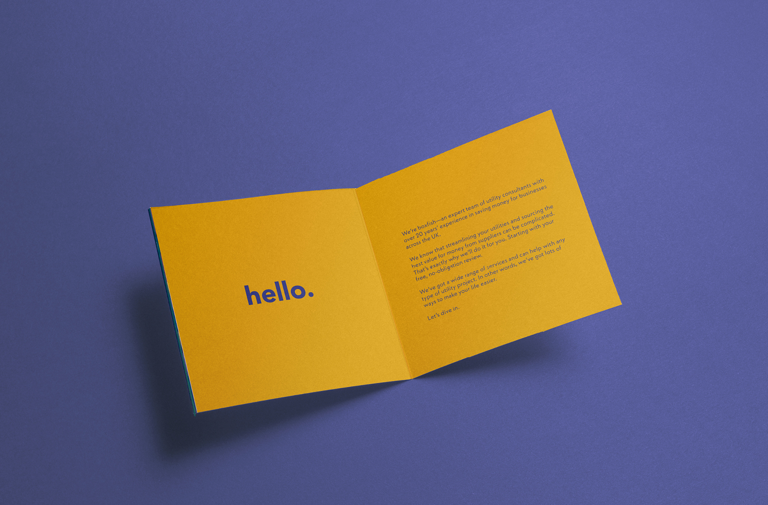
The boxfish’s vibrant blue and yellow colours gave us a vibrant and distinctive colour palette to work from, with its distinctive outline providing inspiration for the logo mark.
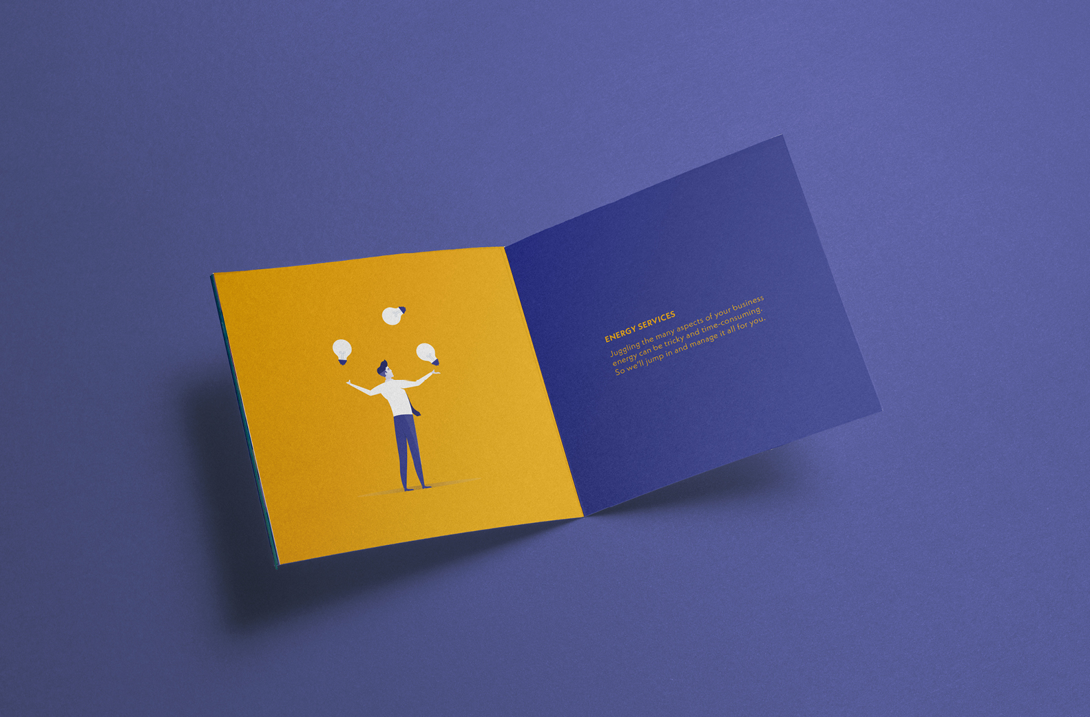
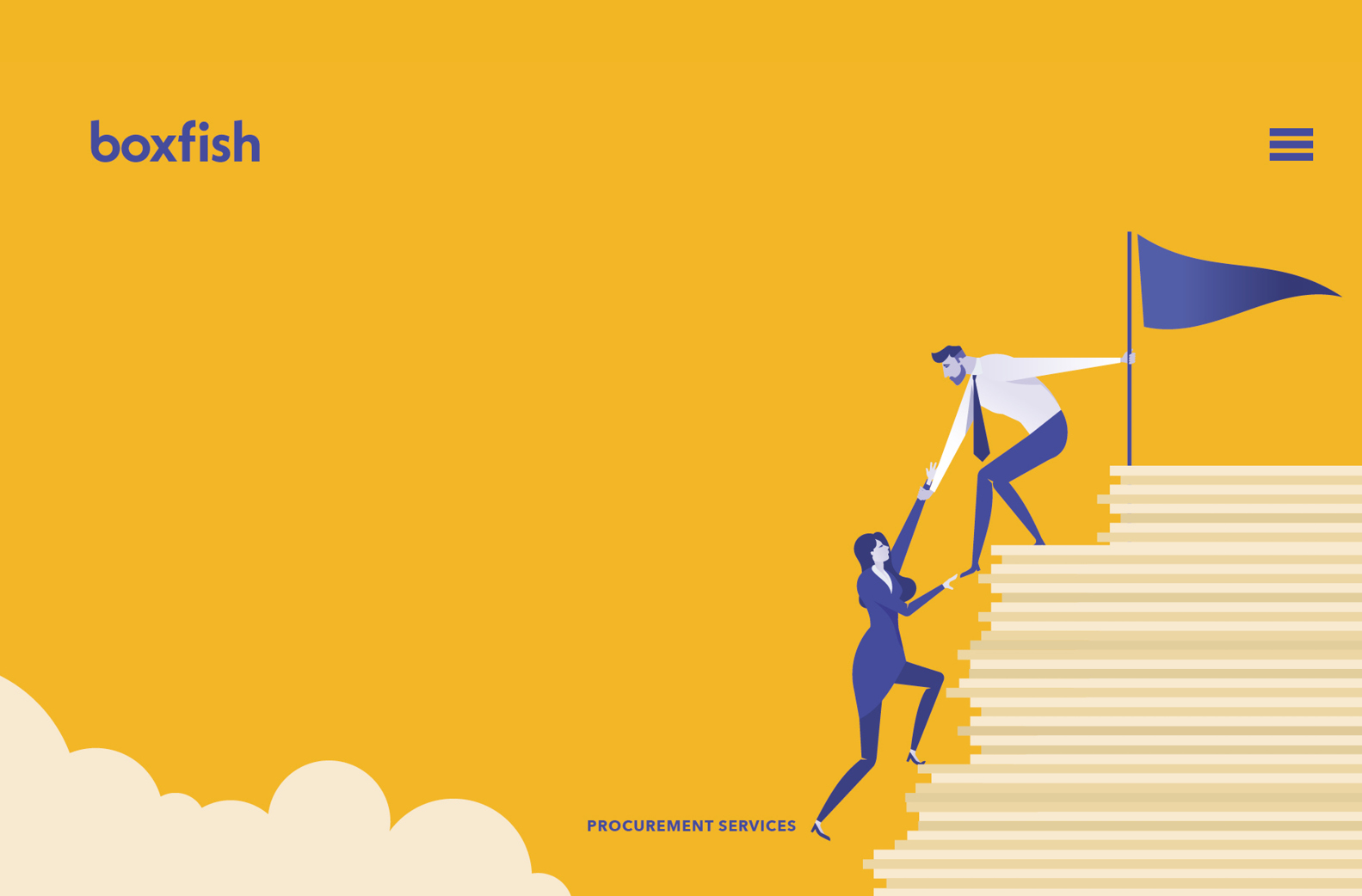
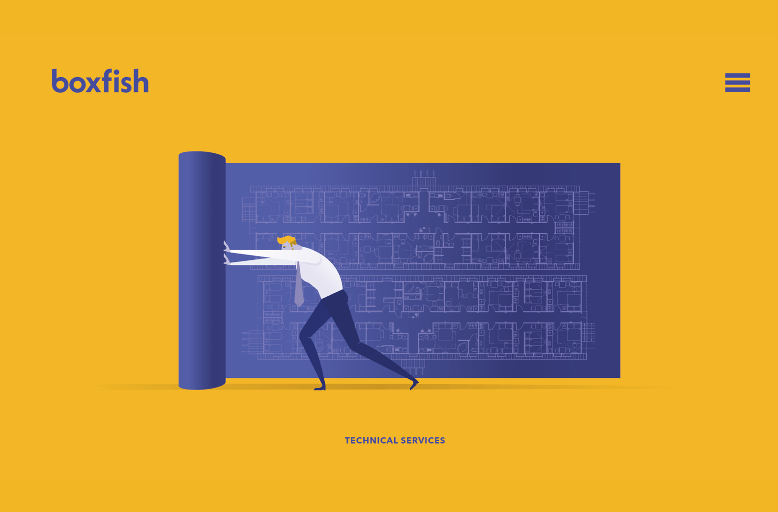
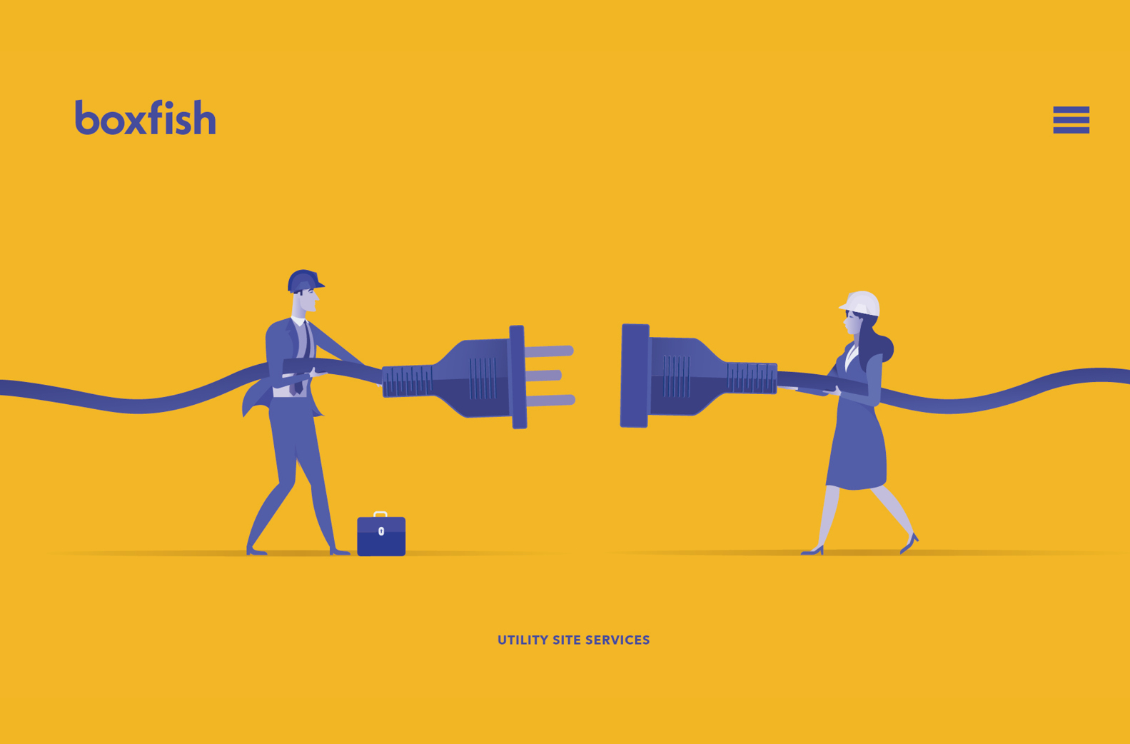
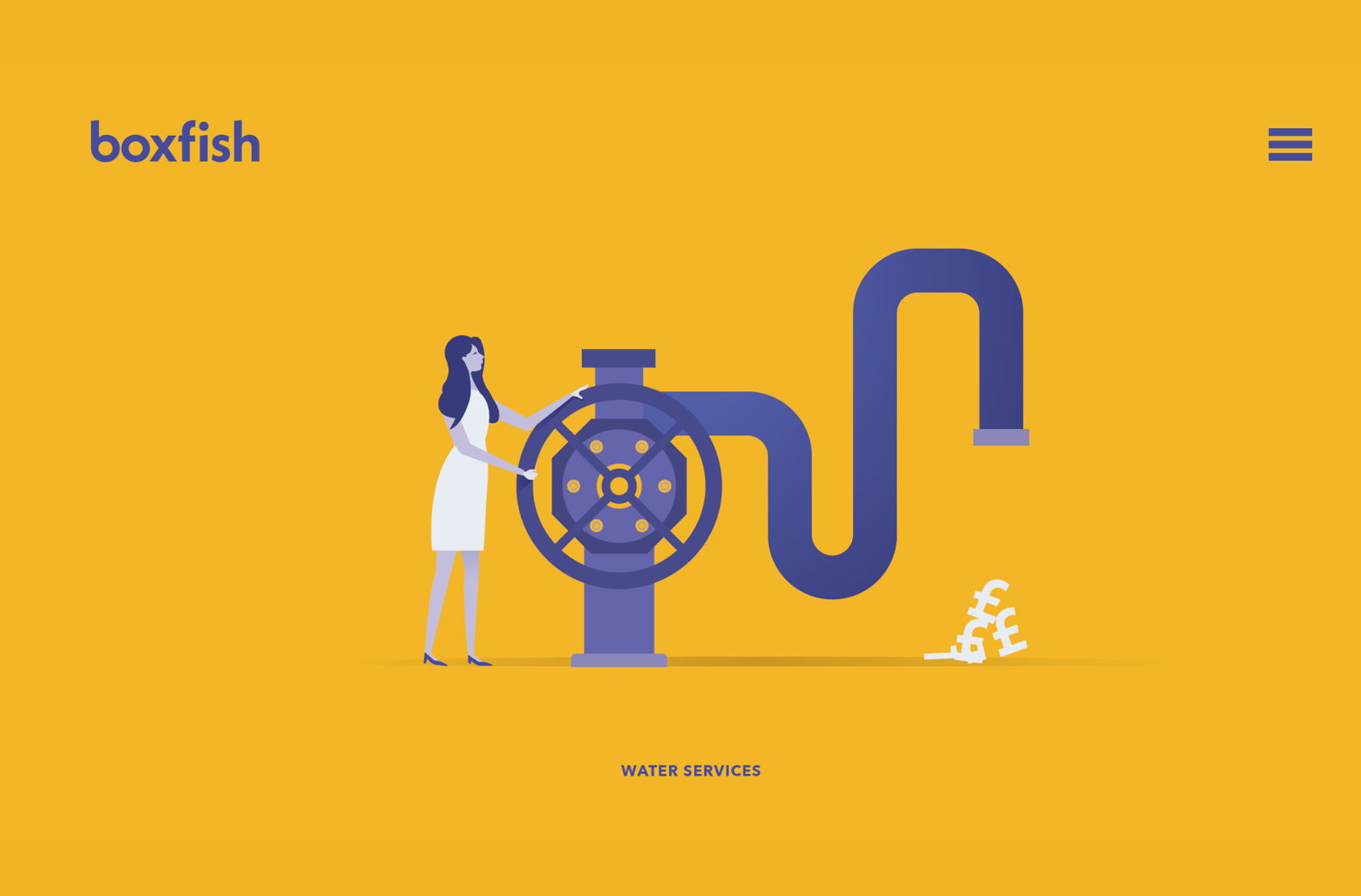
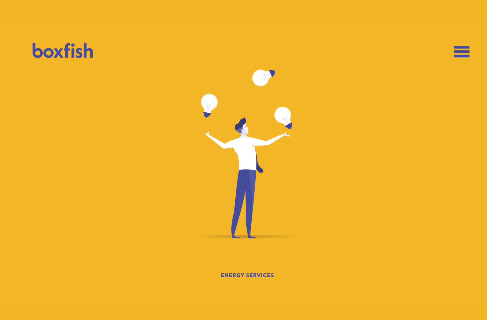
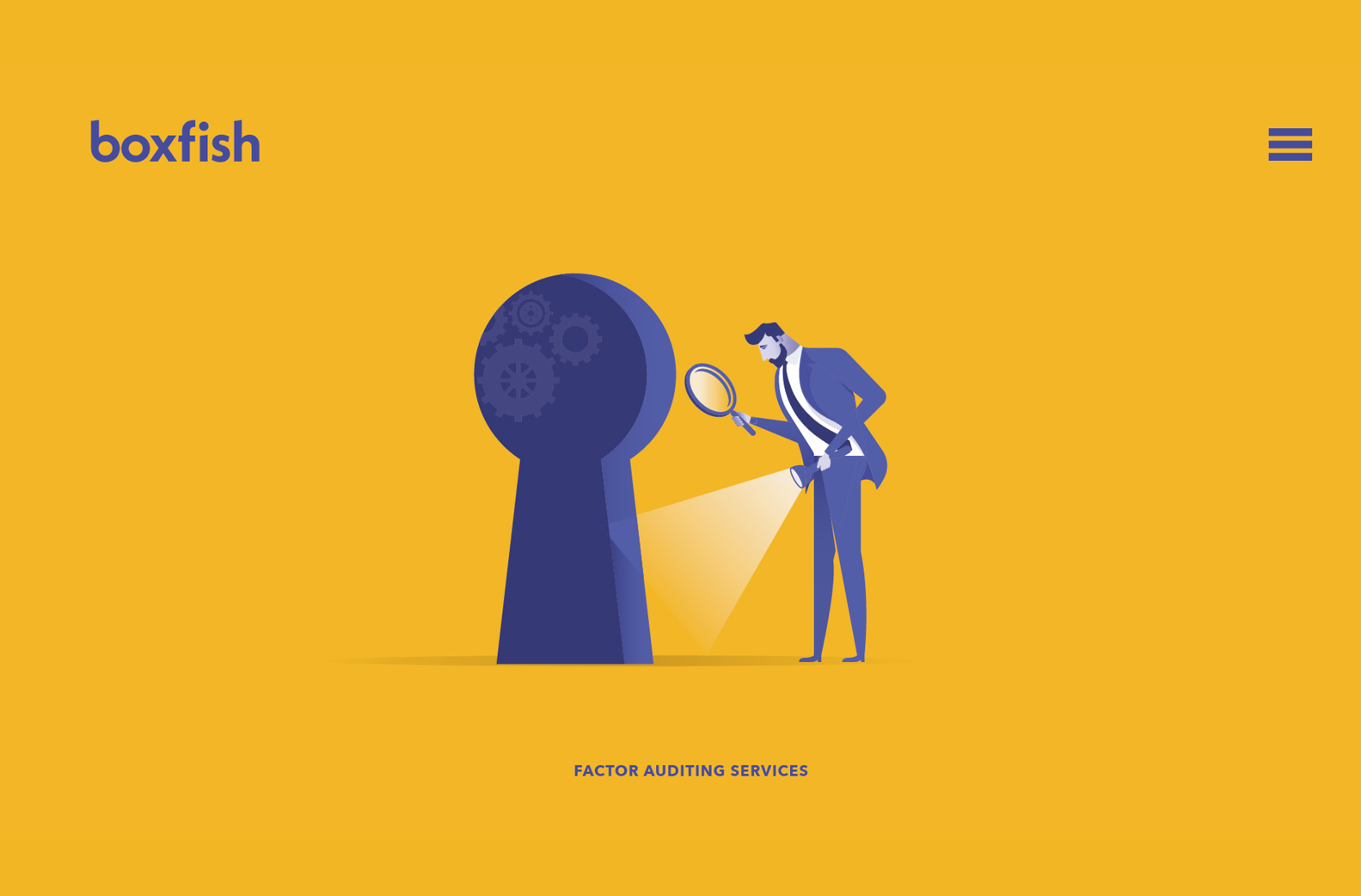
To help highlight the many services on offer at boxfish we developed an engaging illustrative style, showcasing each service with bespoke character illustrations.
The creation of a confident, conversational tone of voice – removing business speak and industry jargon – ensured that brand identity and brand voice aligned seamlessly.
Services
Advertising
Animation
Art Direction
Brand
Copywriting
Digital Marketing
Social
Web
web design
Sectors
Corporate