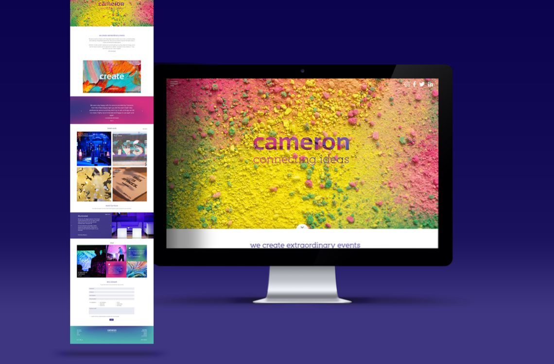
Formerly Cameron Presentations, this forward-thinking, 70-year-old, family-run events company were looking to revitalise their entire communications landscape with a new look and feel across all media channels. Our mission was to design and produce a brand, website and digital comms strategy which projected Cameron’s evolution and confidence within an ever-changing and highly competitive industry.
Using ‘connecting ideas’ as a working strapline, we devised bespoke dot matrix patterns or ‘circle clouds’ which represented the notion of connectivity and alluded to light / sound wave patterns. This formed the cornerstone of the brand identity and allowed for extensive flexibility in creative execution. A vibrant and confident set of colour gradients were developed, working harmoniously with the circle clouds and providing the brand with a robust, flexible graphical backdrop. The clean, confident brand identity was then deployed in a number of new marketing materials, including letterheads, business cards, brochures, bespoke envelopes, van livery and signage. Added value came from the development of a bespoke desktop app which animates the circle cloud pattern, allowing for variations in both ring speed and wave width.
A clean, modular web build was designed and developed which projected Cameron as leaders and innovators in their sector and projected the company as an ‘Events Agency’.
Copy style was an integral aspect of the new Cameron identity – they were looking for a fresh and bold tone which differentiates them from their competitors and aligns with their ‘fun, friendly, creative’ ethos. All copy for both offline and online comms was written from the ground up by Maguires’ in-house copywriting team, ensuring both brand identity and copy style align seamlessly.
Our social and digital strategy needed to be vibrant, on-brand and engaging, ensuring cut-through to captivate the Cameron crowd and increase social interactions. Using a mix of paid-for and organic content on Facebook, LinkedIn, Twitter and Instagram, as well as a robust Google AdWords campaign, our strategy and content creation ensured huge spikes in engagement and massive increases in website click-throughs and online enquiries.
Check out the new website and some of the stats below.
www.wearecameron.com
Website sessions up by 70%
Page views up by 75%
User session duration up by 31%
Pages per session up by 18%
The stats above reflect the % change in key stats on the old Cameron website vs. the new Cameron website for a period of 30 days after launch.